Overview
Family Messaging app is made with the sole intent of connecting family and loved ones together seamlessly.
You can skim over material if you please to do so. Please note that this section contains many videos that go more in depth. For most context I recommend watching. Average video is about 3 or 4 minutes long.
Prototype

Methods:
September 20th, 2021- October 6th, 2021
User Flows
Mockups
MVP
Design system
Prototyping
Timeline:
Tools:
Figma
notion
loom
Coolors.io
Fontjoy
My Role:
Designer
Introduction
Task list:
1. Color & typography
2. Create mobile intro app screens
3. Create a design system
4. Design a log-in form
5. Design an account settings page
6. Design an interactive prototype
Color & Typography

Beginning with Color theory/typography fundamentals I wanted to go for a more friendly appeal to both child and adult. Children want to see something that is appealing to them. Children from my experience are very visual.
Complimentary analogous
Pink- less serious
Blue- calming
orange- energy/ happiness
Sans-Serif used to be more energetic along with using bolder text in titles to grab more attention. I selected typeface with the help of FontJoy.com and type-scale.com in both selection of fonts and sizes.
Reaching AAA standards using plugin “A11y-contrast checker”. Along with material.io.
Create mobile intro app screens
Creation of mobile app intro screens with the color palette and typeface I previously picked for this project. Several iterations were made including the final chosen screens seen here..

Video gives more context to my process and choices made.
Design System

Design system overview
This design system was created with intentions of further building a login flow in Figma. These components with multiple variants.
The goal here was to create active, disabled, error and hover states for each input. Along with toggle switches and radio buttons. Each component has a parent with variants that toggle between states.
This design system was created from scratch within Figma.
Log in form
Log in form purpose serves for users to login in and ability to sign up.

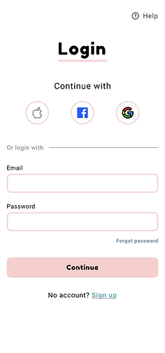.png)
Account settings page
.png)
.png)

Interactive prototype

Summary
Family messaging app next steps will be to fully implement a chat system and bring this to life as well as conduct user testing. In conclusion, this project was a step-by-step process with every detail considered. This project was presented to a team of designers when completed.
Next Steps
User Testing
Polish UI
What I learned
This self directed case study has taught me many things. Accessibility, Design systems, prototyping, Color theory, Atomic design, among others. I reflect on this project with a smile and think about how much fun I had building it. One thing I wish I knew while completing this project is the amount of time it takes to build a design system and make sure it is properly functioning. Thank you for reading!
Next Project:

UX Cabin onboarding